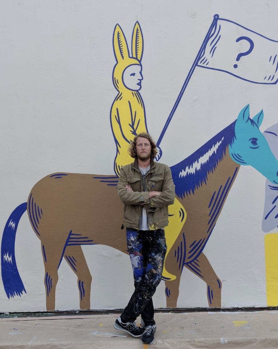
When we tapped SoCal artist Dave Van Patten to create the artwork for our Madison Square Garden releases, we knew he would capture the "concrete jungle" spirit of the early '80s Big Apple with his intricate, layered style. What we didn't know was how the Dead's psychedelia era and the sense of synesthesia it inspired would lead to a whole new cast of characters that are at once recognizable and relatable while simultaneously otherworldly.
Let’s start by taking a look at your history as an artist...when you got started, how you got started, and your influences.
I think as early as first grade I started making little comic strips in my notebook inspired by Calvin and Hobbes and Far Side. By sixth grade, I was making full length superhero comics and some hilarious, gory horror comics. I continued with art and comics until my second year of college, where I actually stopped doing visual art for seven years. During that time, I studied creative writing in college but my real passion was playing music. I started out in a punk band and eventually a few years later transitioned into playing in "freak folk." We toured around the country in 2008 when the freak folk scene was at its peak and it was one of the best trips of my life. And toward the end of the trip, fate kinda led me back into visual art. We were staying with a fellow band in Olympia, Washington and I stumbled upon their impressive zine library. It was the first time I had ever actually seen a zine and was totally inspired by the notion of making a self published comic, very similar to what I did in sixth grade. My band broke up shortly after that, and I was sitting on seven whole years of ideas bubbling out. About a year later in 2009, I self published my first collection of comics which was kind of a local hit in Long Beach, and that’s what jumpstarted my art career. I started doing larger pieces, then gallery shows, and eventually murals and commissioned illustration work. Never in a million years did I think that one day I’d be doing album art for the Dead. It’s been a long strange trip where one thing kind of leads to another and all of a sudden I wake up and I am working with Rhino Records which is amazing. But it’s been a lot of blood, sweat, hunger, stress, and insecurity along the way. Being a professional freelance artist is not for the faint of heart.
My style is actually pretty similar to how I drew even as a kid, however it’s definitely been refined and inspired along the way by a lot of amazing artists. In the early stages of my professional career I was really inspired by the line work and crosshatching of Edward Gorey and R. Crumb. Also hugely inspired by the colors and psychedelic imagery of Heinz Edelmann, Seymour Chwast, and the surrealism of Magritte. There is also a more visceral aspect that is inspired by Mike Judge and Daniel Johnston. Along side these visual artists, I feel constantly inspired by other forms of art as well. Psychedelic rock constantly keeps the wheels turning in my mind as I’m drawing. I feel like it’s pretty difficult for me to draw without music playing. I’m also extremely inspired by film. The surrealists Jodorowski and Lynch, but I’d also say the comedy tone of certain films has really inspired the humorous tone of my work. Particularly the absurdist Monty Python and the Holy Grail and early 1990s SNL. I think I was just the ripe age to where that type of comedy didn't just inspire my sense of humor, but also my work as a whole. I became an absurdist.
You cite comics, 1960s surrealism, psychedelia, and “societal absurdity” as influences. You and Jerry would have surely been friends! How do you fold these into your work?
I think the biggest crime is creating boring artwork. I grew up in a small town where the only artwork I would see around town was watercolor landscape paintings. 1960's psychedelia became attractive to me at a fairly young age because it represented people who didn’t quite fit in with the masses but created a cool living community for themselves, people who lived exciting, weirdo, boundary-crossing lives with the desire to seek philosophical truth without taking themselves too seriously. I try to reflect the same philosophical values and psychedelic humor tone in my work. Anytime I draw something normal I always consider how it could be flipped around. Put the feet where the head is and the head where the feet are. It's such an easy little trick but it completely changes the image to something imaginative. I still don’t really take myself too seriously. I think the playfulness of the 60s will always be in important part of my work. Approaching the theme of societal absurdity is a bit more in line with the activism aspect of my work. I’ve always been inspired by the quote “comfort the disturbed and disturbed the comfortable. “ I think all good art achieves one of these purposes. The absurdity and injustice of modern society is hard to deal with and most of us feel powerless, but if you can draw something that really slaps some cold water across someone’s face, or even your own face. No one likes a didactic person but if you do it through art it is more welcoming because the imagery is still open to interpretation. The image we can plant to seed that later develops into some form of self change. But on the flip side not everyone needs a slap in the face. Some of us just need a warm hug. I also try to create art like that. When I listen to American Beauty, I feel a sense of comfort and appreciation of life- gratitude to be alive and that such a beauty exists around us. Both sides of the coin are equally important to me.
Folks traveling around Southern California might stumble upon one of your murals. How do you translate your work from such a large scale format to things like prints, t-shirts, and packages?
This question is funny because it’s actually the reverse order. I started small with comics and design, then later had to find a way to blow that up to span across huge buildings. Most of my drawings are really detailed and I like the idea of pulling in the viewer as opposed to giving them something they can spot from far away. I don’t like surface-y glances. I want to pull you into a world. It was difficult to do that with murals at first because a lot of the successful muralists got famous doing huge eye-popping singular characters, where a lot of my work focuses on community and having a multitude of characters and personalities interacting with each other. It’s not the type of thing you can fully take in a first glance. It kind of forces you to slow down which can be annoying to some, but I think that the restoration of patience in our society is extremely important. When I was a kid if I bought a CD and it kind of sucked at first listen, I would continue to listen to it, and after a bunch of time passed I would notice intricacies that I hadn't before and grew in appreciation. Also some of my favorite films are like this. It took me three viewings to even get through 2001 Space Odyssey without falling asleep. But now I’ve seen it probably 30 times and it's my favorite film of all time. And every time I still notice more details. So whether it be album work, comics or mural work I always want to create a world that requires time and attention in order to fully grasp it.
Let's get into the just released Madison Square Garden sets. What criteria were you given in terms of design?
I was approached by Lisa Glines and Doran Tyson to create something different than the typical character tropes of my earlier work. Sometimes when you do a lot of commission work, you can get burnt out having to develop completely original concepts day after day. So a handful of my characters I have reused in different projects and they’re kind of iconic to me. However Lisa challenged me to try something totally new. Since the project era was New York in the early 80s we liked the idea of creating a rendition of a "concrete jungle." The charge was to have no human characters at all. And the challenge to try to avoid skeletons and too much traditional Dead imagery tropes. Only animals and creatures. Even the more traditional animals that I drew in the early drafts were rejected and I was encouraged to develop more original creatures. Another one of my early drafts was almost more Punk than Dead because I was focusing too much on the gritty vibe of the early 80's rather than the magic of the Dead.
So I felt kind of stuck for a while not knowing how to create "concrete jungle meets Dead" imagery without skeletons and without the comfort of my traditional characters.
However, the process of how I finally created the album art was actually extremely meaningful to me.
I remember hearing from a Dead documentary- the guys talked about how during their live shows the music would magically communicate things to the audience through the ether, and in turn the audience would communicate back to them. Like a weird psychic channel connected through the music. At the time of working on the album art, I was often revisiting the live 1969 Fillmore album and finally ended up experiencing this myself. I immersed myself in that album constantly and eventually started receiving ideas through the creative channel about how to develop the characters and setting. I feel like the Dead spoke to me, and showed me how to draw the design. I’ve never had this experience with any other album work. Is extremely moving to me to feel like I was part of the magic channel and I am actually getting emotional this very moment while even thinking about it.
Your work is much like the Dead’s in that it has a rich iconography. What elements do you consider important to creating a signature style? What parallels can be made with your art work and the Dead’s?
Having a signature style can be a bit of a conflict. My favorite contemporary artist, Nick Gazin once said to avoid style. Just focus on drawing itself. Draw the world. Just draw draw draw. And hopefully through that your authentic style comes through. I’m horribly miss quoting my favorite artist but that was the gist that I gathered. I received some early success and started getting wrapped up in being a one trick pony with my style. Even to this day, myself and probably most artists I know get insecure about not wanting to be a one trick pony. I do love my style, but don't want it to feel like a trope. I want to constantly challenge myself to grow. Regardless, I definitely have an array of repeated imagery, mostly weirdo characters and arrangement styles. Some of it is purely aesthetic and some of it is more philosophical. Most notable is my obsession with the number 3. I always do things in 3's because 1 is too central, 2 is too symmetrical (like 4). But 3 is a perfect balance of offset symmetry. It’s like a paradox. It's a wheel with jagged edges.
It’s hard to accurately draw parallels between my work and one of the most legendary bands of all time. Obviously the playful imagery comes to mind.
However I'd say the deeper thing would be the sense of synesthesia and magical inspiration. The same way the Dead music inspires color visuals and entire landscapes, my work is synesthetic in the opposite way. My colorful landscapes arrive through listening to music. In order to achieve some of the beauty that the Dead achieved, it seems like they had opened their minds to a state of creative trance while performing and I feel that same sort of trance sometimes while drawing.

DAVE VAN PATTEN'S GRATEFUL DEAD
First exposure to the Dead/first show: My first Dead experience was actually right around the time Jerry died. I was 14 and hadn’t heard the music much growing up. Around that time I heard Workingman's Dead. It was a good intro for me and paved the way for me to get into the more psychedelic stuff later.
Favorite Dead Song/Songs: Favorite studio album is American Beauty and Box of Rain is my favorite song from that album. Every time I hear that song it moves me.
Favorite live album: Fillmore/1969. Favorite track off that is "Dark Star."
Favorite Dead Era/Years: All the different areas of the Dead have elements that make them unique and constantly refreshing but I've got to say the origin in the 60s is probably still my favorite. Something about the grittiness that permeates a band when they are first starting out is extremely magnetic to me.
Desert Island Dead: On a deserted island if I could take just one album that would be Fillmore/69
Being A Dead Head Means…In my humble opinion being a Dead head as opposed to just a Dead fan comes from either having the experience of following the Dead on tour and trenching yourself in that community or, like myself, having an isolated kind of spiritual experience where your mind opens up and all of a sudden you “get it." The Dead and all of their magic kind of makes sense to you.
You can learn more about Dave Van Patten's work at davevanpattenart.com.
When we tapped SoCal artist Dave Van Patten to create the artwork for our Madison Square Garden releases, we knew he would capture the "concrete jungle" spirit of the early '80s Big Apple with his intricate, layered style. What we didn't know was how the Dead's psychedelia era and the sense of synesthesia it inspired would lead to a whole new cast of characters that are at once recognizable and relatable while simultaneously otherworldly.
When we tapped SoCal artist Dave Van Patten to create the artwork for our Madison Square Garden releases, we knew he would capture the "concrete jungle" spirit of the early '80s Big Apple with his intricate, layered style. What we didn't know was how the Dead's psychedelia era and the sense of synesthesia it inspired would lead to a whole new cast of characters that are at once recognizable and relatable while simultaneously otherworldly.
dead comment
Dave's My Hero
I have been ranting and raving about the In and Out of the Garden artwork all over the internet. What AMAZING work. I am obsessed. Good job, Dave!
Fillmore/1969
I wonder which album Dave is talking about in this article - Fillmore West 1969 3-CD?, Fillmore East 2-11-69? Fillmore West Box Set? Live Dead studio album? This In/Out of the Garden Box Set is one of my all time favorite designs - great job Rhino and the "Daves"!
DAVES PICKS VOL. 47
Damn !
Been trying to pre order Daves Picks Vol. 47...But it won`t let me do it !,,,I`ve tried and tried and tried !
Whats wrong ?.....I`m putting in all the correct info ..Name, Address, CC #, etc. But NO GOOD ! C`mon Dead Net What Gives ??????...TOM TOM
Tom
We're on Dave's 46 as the new one today and they always have trouble on the first roll out. Try one of these 3 ways to get your issue seen by the powers that be.
1. Private message MARYE using the message tab on top right of screen drop down box.
2. Post on the brand new DaP 46 thread (or existing 45 thread we all use for daily banter, Marye does look at those sometimes) again using drop down box at top right of page under Recent Posts.
3. Go to the Got Issues With Your Store Order tab under top of page Community > User Concerns > Got Issues....
No one will likely see it here under the artist Dave Van Patten thread.
Cheers and good luck.


Which album is intended for ?
I wonder which album Dave is talking about in this article - Fillmore West 1969 3-CD?, Fillmore East 2-11-69? Fillmore West Box Set? Live Dead studio album? This In/Out of the Garden Box Set is one of my all time favorite designs - great job Rhino and the "Daves"!
I have been ranting and raving about the In and Out of the Garden artwork all over the internet. What AMAZING work. I am obsessed. Good job, Dave!